Your Social Media Reporting Dashboard Guide


If you're still drowning in spreadsheets to track your social media, it's time for a change. A social media reporting dashboard is your command center, turning chaotic streams of data into clear, actionable insights. Think of it as the cockpit for your social media strategy—it gives you all the critical instruments you need to navigate and steer your brand toward its goals.
Why You Need a Social Media Reporting Dashboard
Manually pulling data from each social platform is a recipe for burnout and missed opportunities. You jump between Facebook Insights, X Analytics, and LinkedIn Page data, trying to stitch together a coherent story from a pile of disconnected spreadsheets. This fragmented approach isn't just inefficient; it makes seeing the bigger picture nearly impossible.
A social media reporting dashboard cuts through the noise by pulling all your key metrics into one unified, visual interface. It’s the difference between trying to navigate a new city with a compass and a dozen scattered maps versus using a real-time GPS.
From Manual Data Entry to Strategic Intelligence
Instead of burning hours on tedious data collection, a dashboard automates the entire process. This frees you up to focus on what actually matters: analysis and strategy. You can instantly see which campaigns are hitting the mark, spot audience engagement patterns, and make informed decisions on the fly. It's a game-changing shift from reactive reporting to proactive strategy.
By connecting data points from different platforms, a dashboard helps you:
- Track Performance in Real-Time: Get an immediate pulse on your campaign health without waiting for stuffy end-of-month reports.
- Identify Cross-Channel Trends: Discover how your audience behaves on Instagram versus LinkedIn and tailor your content to fit.
- Demonstrate ROI Clearly: Easily show the value of your social media efforts to stakeholders with professional, easy-to-understand visuals.
Making Sense of a Massive Audience
The scale of social media today is just staggering. By mid-2025, the global user base hit roughly 5.41 billion individuals, with about 7.6 new users joining every single second. A dashboard is essential for wrangling the massive volumes of data from this ever-expanding audience and turning it into something you can actually use.
A great dashboard moves you beyond just reporting what happened. It provides the clarity needed to understand why it happened and guides you on what to do next to win.
Ultimately, a dashboard is more than just a reporting tool; it's a strategic asset. It's the foundation for building a consistent and powerful online presence, which is a cornerstone of effective social media branding. To really dig into the benefits, you can Master Your Strategy with a Social Media Dashboard. This central hub ensures your efforts are always aligned with your goals, turning scattered data into a clear path forward.
Tracking Metrics That Actually Matter
A great social media dashboard does more than just throw numbers at you; it tells a story. But here’s the thing: not all numbers are created equal. It's way too easy to get caught up in vanity metrics, like follower counts or total likes. They look great on the surface but often have zero connection to what actually moves the needle for your business.
Real success is about tracking the metrics that matter—the ones that show your impact, sharpen your strategy, and prove your ROI.
Think of it like a car's dashboard. Your speedometer (follower count) is nice to glance at, but it's the fuel gauge and engine temperature (engagement and conversion rates) that tell you if you're actually going to make it to your destination. To build a dashboard that works, you need to look past the superficial data and group your metrics around your core business goals.
Beyond Follower Counts: Audience Growth Metrics
A huge follower count might feel impressive, but the quality and growth rate of your audience are what really count. A small, fired-up community is a thousand times more valuable than a massive, silent one. Your dashboard should show you how your audience is evolving.
- Follower Growth Rate: This shows you the speed at which you’re gaining new followers, usually as a percentage. It’s a great way to see if your content is consistently pulling new people into your orbit.
- Audience Demographics: Who are you really talking to? Keep an eye on age, gender, location, and language to make sure you're hitting the mark with your target audience.
- Follower-to-Following Ratio: A healthy ratio usually points to a credible, authoritative account, not one that just mass-follows accounts hoping for a follow-back.
Measuring Connection: Engagement Metrics
Engagement is the heartbeat of your social media. It proves your content is interesting enough to make people stop scrolling and actually do something. High engagement is a powerful signal of a strong community and often a leading indicator of brand loyalty and future sales.
This visual breaks down some key performance indicators, including the all-important engagement rate.
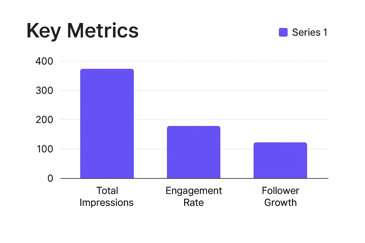
As you can see, engagement rate might be a smaller number than something like impressions, but it represents a much deeper level of connection with your audience.
Here are the engagement metrics you can't ignore:
- Engagement Rate: This is the percentage of your audience that liked, commented, shared, or saved a post. It's the ultimate measure of your content's quality.
- Comments: This is direct, unfiltered feedback. Analyzing comments gives you real insight into how people feel about your brand and what you're posting.
- Shares or Retweets: When someone shares your content, they're giving you their personal stamp of approval. It’s a powerful form of organic amplification that money can't buy.
Understanding Visibility: Reach Metrics
Reach tells you how many unique people actually saw your content. It’s the very top of your funnel, measuring how far and wide your message is spreading. While impressions count every single time your content is displayed, reach zeroes in on the distinct size of your audience.
A sudden spike in reach, especially from people who don’t follow you, is a sign that your content might be going viral or is hitting the sweet spot with platform algorithms. This metric is absolutely fundamental for brand awareness campaigns.
You can even drill down to compare reach from followers versus non-followers. This is huge because it tells you if your content is breaking out of your existing bubble and catching the attention of new people. Our guide on how to measure social media success dives deeper into finding the right data points to watch.
Proving Value: Conversion Metrics
At the end of the day, your social media efforts have to connect back to business results. Conversion metrics are the bridge between your social activity and tangible outcomes like sales, leads, or sign-ups. This is where your dashboard proves its worth in dollars and cents.
- Click-Through Rate (CTR): What percentage of people who saw your post actually clicked your link? A high CTR means your call-to-action was compelling and your content was on point.
- Conversion Rate: Of the people who clicked, how many completed the desired action? This could be making a purchase, signing up for a newsletter, or downloading a guide.
- Cost Per Conversion: For paid ads, this metric is critical. It calculates exactly how much you spent to get one conversion, giving you a clear look at the efficiency of your ad spend.
Choosing the Right Dashboard Tools
Picking the right social media reporting dashboard is a lot like choosing a car. A simple sedan is great for getting around town, but you'll need something far more rugged for a mountain expedition. The best tool for you depends entirely on where you're headed—your specific goals, your budget, and how tech-savvy your team is.
The market is flooded with options, each built for a different kind of user. To make the right choice, you need to look past flashy feature lists and start with an honest assessment of what you actually need.
Understanding Your Options
Most tools fall into one of three buckets, each offering a different mix of simplicity, power, and cost. Getting familiar with these categories is the first step to finding the perfect fit for your team.
- Native Platform Analytics: These are the free, built-in tools from the social networks themselves, like Meta Business Suite or X Analytics. They’re fantastic for beginners or anyone with basic reporting needs because they pull foundational data straight from the source.
- Dedicated Third-Party Tools: This is where you’ll find specialized platforms like Sprout Social, Hootsuite, or Buffer. They are designed specifically for social media management, bundling cross-platform reporting, scheduling, and advanced analytics into one package.
- Custom Business Intelligence (BI) Solutions: Tools like Google's Looker Studio or Tableau are the big guns. They offer maximum flexibility, letting you pull data from countless sources to build a social media reporting dashboard that’s completely tailored to your unique KPIs.
Evaluating Tools Based on Key Factors
Once you know the landscape, you can start weighing your options against a consistent set of criteria. Your goal isn't just to find a good tool; it's to find the right tool for your team's workflow.
Here are the critical factors to keep in mind:
- Integration Capabilities: Does the tool play nice with all the social platforms you use? Just as important, does it connect to your other marketing software, like Google Analytics or your CRM?
- Scalability: Will this tool grow with you? A solution that’s perfect for a small team today might feel cramped and restrictive as your social media presence expands.
- Ease of Use: Is the learning curve a gentle slope or a vertical cliff? A tool packed with powerful features is useless if your team finds it too confusing to use every day.
- Pricing and ROI: The cost needs to make sense for the value it delivers. Look for clear, transparent pricing that fits your budget without forcing you to pay for a bunch of features you’ll never touch.
A common mistake is choosing a tool based on its features rather than your team's workflow. The best dashboard isn't the one with the most bells and whistles; it's the one that becomes an invisible, effortless part of your daily strategy.
For instance, this dashboard from the Looker Studio gallery shows how you can visualize complex marketing data from multiple sources in one clean interface.
This kind of visualization is a game-changer for teams that need to connect social media performance to broader business goals like website traffic and conversions.
Making the Final Decision
Ultimately, the right tool should empower your team, not create more work.
A small business might do just fine with the simplicity of native analytics paired with a solid social media content calendar. A growing agency, on the other hand, will probably need the all-in-one power of a third-party tool to manage multiple clients efficiently.
And for a large, data-obsessed enterprise? A custom BI solution offers unmatched depth, letting them build a true command center that visualizes the entire customer journey. By carefully weighing your needs against these options, you can pick a tool that truly fits your strategic ambition.
Designing a Dashboard That Tells a Story
A great social media dashboard does more than just display charts and numbers. It tells a story. Anyone can dump raw data onto a screen, but that just creates noise and confusion. A truly effective dashboard cuts through that noise, weaving all those data points into a clear narrative that helps you make smarter decisions.
Think of it this way: a pile of bricks is just a pile of bricks. But with a solid blueprint, an architect can arrange them into a house. Your metrics are the bricks. Your dashboard design is the blueprint that gives them meaning, structure, and purpose. It guides the viewer from one insight to the next, building a complete picture of whether your social media strategy is actually working.
Start with the Narrative First
Before you even think about dragging and dropping a chart, stop and ask yourself one simple question: What is the most important story I need to tell?
Maybe you're trying to show campaign growth over time. Or perhaps you need to compare which content pillars are resonating the most. It could even be about proving the direct link between a spike in social engagement and a bump in website conversions.
Your answer to that question sets the entire narrative. Once you know the story, you can pick the right characters (your KPIs) and plot points (your data visualizations) to bring it to life. This approach ensures every single element on your dashboard has a job to do, preventing the dreaded "analysis paralysis" that comes from staring at a screen full of unrelated data.
Choose Visualizations That Clarify, Not Confuse
The kind of chart you select can either shine a spotlight on an insight or bury it completely. Matching the right visual to the right data is fundamental to good dashboard design. Each chart type has its own storytelling superpower.
Here’s a quick guide to pairing your data with the right visual:
- Line Charts for Trends: Need to show performance over time? Line charts are your go-to. They’re perfect for tracking things like follower growth, engagement rates, or website traffic from social media on a month-over-month basis. That upward or downward slope tells an instant story of progress or decline.
- Bar Charts for Comparisons: When you need to stack things up against each other—like engagement on Instagram versus LinkedIn, or how video posts are performing compared to static images—bar charts are your best friend. They make side-by-side comparisons clean and intuitive.
- Pie Charts for Composition: Use these sparingly, but they’re solid for showing parts of a whole. A pie chart can be a great way to visualize the breakdown of your audience by platform or the percentage of traffic coming from different social channels.
- Scorecards for Key Numbers: For those critical, top-line metrics (think total conversions or overall ROI), use big, bold scorecard widgets. They grab immediate attention and put the most important numbers front and center, which is exactly what leadership wants to see.
Tailor the Story to Your Audience
Let's be real: a single dashboard rarely works for everyone. The story you tell your CEO needs to be fundamentally different from the one you share with your social media specialists. A great dashboard designer understands this and creates different views for different stakeholders.
Your executive team doesn't need to see the click-through rate of every individual post. They need a high-level summary that connects social media efforts to business outcomes. In contrast, your content team needs granular data to see what’s working and what isn’t.
For example, you could build two distinct views:
- The Executive View: This is the high-level summary. It should focus squarely on bottom-line metrics like Customer Acquisition Cost (CAC), Return on Investment (ROI), and total leads generated. The visuals here need to be clean, simple, and instantly digestible.
- The Marketing Team View: This dashboard can get way more detailed. It should include campaign-specific metrics, A/B test results, engagement breakdowns by content type, and even shifts in audience demographics. This is the operational dashboard, the one your team uses for daily optimization.
This audience-first approach is more important than ever. Leadership is no longer satisfied with vanity metrics; they demand clear proof of value. A crucial challenge for marketers is bridging the gap between social media activity and tangible business results. Research shows that 65% of leaders want to see direct correlations between campaigns and business outcomes, while 45% are looking for better data visualizations. A social media dashboard that tells a clear ROI story directly tackles both of these needs. You can learn more about how to present social ROI with clarity on sproutsocial.com.
Ultimately, designing a dashboard that tells a story is all about being intentional. When you start with your narrative, choose the right visuals, and tailor the view to your audience, you transform your dashboard from a static report into a dynamic and persuasive tool for making better decisions.
Connecting Social Media Activity to Real ROI

This is where your social media reporting dashboard truly earns its keep. Beyond the likes and shares, its real job is to answer the one question the C-suite always asks: "What's our return on investment?" An effective dashboard doesn't just show activity; it builds a solid bridge between your social media campaigns and real business outcomes.
Think of your dashboard as a translator. It takes the language of social media—engagement, reach, impressions—and converts it into the language of business: revenue, leads, and customer acquisition costs. This is the shift that elevates you from a content publisher to a strategic driver of growth.
Without that connection, your reports are just a list of things you did. With it, they're proof of the financial impact you're making.
Tracking the Metrics That Close Deals
To really prove ROI, you have to shift your focus from the top-of-funnel awareness metrics to the bottom-funnel numbers that actually lead to sales. These are the metrics that show how your social media efforts turn followers into paying customers. Your dashboard needs to put these front and center.
Key bottom-funnel metrics to include are:
- Leads Generated: This tracks how many people filled out a contact form, signed up for a demo, or downloaded a gated resource straight from a social media link.
- Conversion Rate: This is the percentage of users who take a specific action after clicking through from a social campaign. To nail this, you need a solid grasp of effective conversion rate optimization strategies.
- Customer Acquisition Cost (CAC): This one is non-negotiable for paid campaigns. It’s your total ad spend divided by the number of new customers you gained, showing just how efficiently you're using your budget.
These metrics turn your dashboard from a simple performance tracker into a serious business intelligence tool. They don’t just show what you did, but what you achieved.
Attributing Revenue with Precision
"How do we know that sale came from Instagram?" Every social media manager has heard this. It's the classic attribution challenge. A well-configured dashboard solves this by using specific tracking mechanisms to connect the dots between social activities and revenue. This isn't guesswork; it's data-driven proof.
The most reliable attribution methods involve a few key tools and parameters.
UTM Parameters: These are small snippets of code you add to your URLs that tell your analytics tools exactly where a user came from. By tagging links in your posts and ads, you can trace a customer's entire journey from a specific tweet or Facebook post all the way to a completed purchase.
Tracking Pixels: A pixel is a tiny piece of code you place on your website. When someone who saw your social media ad visits your site and makes a purchase, the pixel "fires," reporting the conversion back to your dashboard.
CRM Integrations: This is the gold standard. Connecting your dashboard to your Customer Relationship Management (CRM) system lets you track a lead from their very first interaction on social media all the way through the sales funnel. It gives you a complete picture of their journey and every social touchpoint that influenced their decision.
With global social media marketing spend projected to shoot past $276.7 billion in 2025, justifying your budget with hard data isn't just a good idea—it's essential.
Ultimately, a dashboard built for ROI tracking gives you the evidence you need to have confident conversations with leadership. Instead of just showing them busy work, you can present a clear, data-backed case for how your social media strategy is fueling real business growth. Plenty of great social media reporting tools are out there to help you achieve this level of clarity.
Your Top Dashboard Questions, Answered
Even the best-laid plans run into questions. When you're building a social media reporting dashboard, a few sticking points always seem to pop up. Let's tackle them head-on.
Think of this as your go-to guide for troubleshooting your dashboard. We'll cover everything from choosing the right metrics to sharing your results, turning a good dashboard into your team's secret weapon.
How Often Should I Update My Dashboard?
There’s no magic number here—the right frequency is all about your goals and the speed of your campaigns. The best way to think about it is in tiers, based on who needs the information and why.
For the marketing team in the trenches, daily or real-time updates are a must. This is how you make quick pivots and optimizations, especially when you're in the middle of a big launch. Catching a spike in ad spend or a dip in engagement rate as it happens can save you a world of headaches.
But for leadership or clients, a weekly or bi-weekly cadence is usually the sweet spot. It provides enough data to spot real trends without drowning everyone in noise. Save the monthly deep-dives for high-level strategy, where you're focused on long-term growth and ROI.
What Is the Difference Between a Report and a Dashboard?
This is a classic point of confusion, but the difference is simple and incredibly important. Here's an easy way to remember it: a dashboard is the live scoreboard at the game, while a report is the post-game analysis you read the next day.
- A Dashboard is Dynamic: It’s your live, at-a-glance view of performance right now. Its whole purpose is monitoring. It gives you a real-time pulse on your key metrics so you can react quickly. Dashboards are visual, interactive, and all about the "now."
- A Report is Static: This is a snapshot of performance over a set period, like last month or last quarter. A report digs deeper to provide context, analysis, and recommendations based on what already happened. It tells a story about what worked, what didn't, and what you should do next.
A dashboard shows you what is happening. A report explains why it mattered. You absolutely need both, but they play very different roles in your workflow.
How Do I Choose Which Metrics to Include?
The single biggest mistake people make with dashboards is packing them with everything. A cluttered dashboard with dozens of metrics isn't just confusing—it's useless. The trick is to be ruthless. Focus only on the Key Performance Indicators (KPIs) that tie directly to your actual business goals.
Start by asking what you're trying to accomplish.
- Goal: Brand Awareness? Prioritize metrics like Reach, Impressions, and Share of Voice. These numbers tell you how many eyeballs are on your content and how you stack up against the competition.
- Goal: Lead Generation? Your dashboard needs to scream Click-Through Rate (CTR), Conversion Rate, and Cost Per Lead (CPL). These are the metrics that connect your social activity to real, tangible leads.
- Goal: Community Building? You’ll want to obsess over Engagement Rate, Comments, and Audience Growth Rate. This tells you if your content is actually resonating and building a loyal tribe.
Before you add a single metric, ask yourself this question: "What decision will this number help me make?" If you don't have a clear answer, leave it out.
Can I Build a Dashboard for Free?
Absolutely. While there are plenty of powerful, paid tools out there, you can build a seriously effective social media reporting dashboard without spending a dime. The best part? You're probably already using the tools you need.
- Native Platform Analytics: Every major social network—Meta, X, LinkedIn—has its own free analytics dashboard. You can't combine data across them, but they're a fantastic place to start for platform-specific insights.
- Google's Looker Studio: This is probably the most powerful free dashboarding tool on the planet. You can pull in data from different sources (like Google Analytics and Google Sheets) and build fully custom, interactive dashboards that look amazing.
- Spreadsheet Software: Don't sleep on tools like Google Sheets. With a bit of setup, you can build surprisingly robust dashboards. You can import data manually or use add-ons to automate it, then use the built-in charts to visualize your KPIs.
A great way to make sure your free dashboard is on the right track is to start with a solid audit. Our social media audit checklist is a perfect guide for identifying the most crucial data points you should be monitoring from day one.
Quick Answers to Your Dashboard Questions
To wrap things up, here’s a quick-glance table summarizing the most common questions we hear about building and using social media dashboards.
| Question | Key Takeaway |
|---|---|
| How often should I update it? | Daily/real-time for your team, weekly/bi-weekly for leadership and clients. |
| Dashboard vs. Report? | A dashboard is a live monitor (the scoreboard); a report is a static analysis (the post-game recap). |
| Which metrics should I include? | Only KPIs that directly align with your business goals. If it doesn't inform a decision, cut it. |
| Can I build one for free? | Yes! Use native platform analytics, Google's Looker Studio, or even a spreadsheet to start. |
Remember, a dashboard isn't just about tracking numbers—it's about making smarter, faster decisions. Keep it clean, keep it focused, and you'll have an invaluable tool for growth.
Ready to stop guessing and start growing? MakerBox uses AI to optimize your entire professional online presence, from your bio and profile photo to your social media content. Generate high-impact posts, track your performance, and watch your engagement and opportunities multiply.